Overview:
Shiftboard is employee scheduling and workforce management software designed to be highly customizable and work across various industries. Their site was not responsive, had layers upon layers of navigation and filtering, and featured cluttered and confusing information architecture. I was brought in a few months into the project to help clarify the IA, solve complex information management issues, and translate user flows and scenarios into wireframes for testing. I also designed user interactions for development handoff.
Role: Wireframes, UI, IA, Documentation
Visual Design Director: Kurt Hinz
Product Designer: Marissa Hui
Agency: Mentor Creative Group

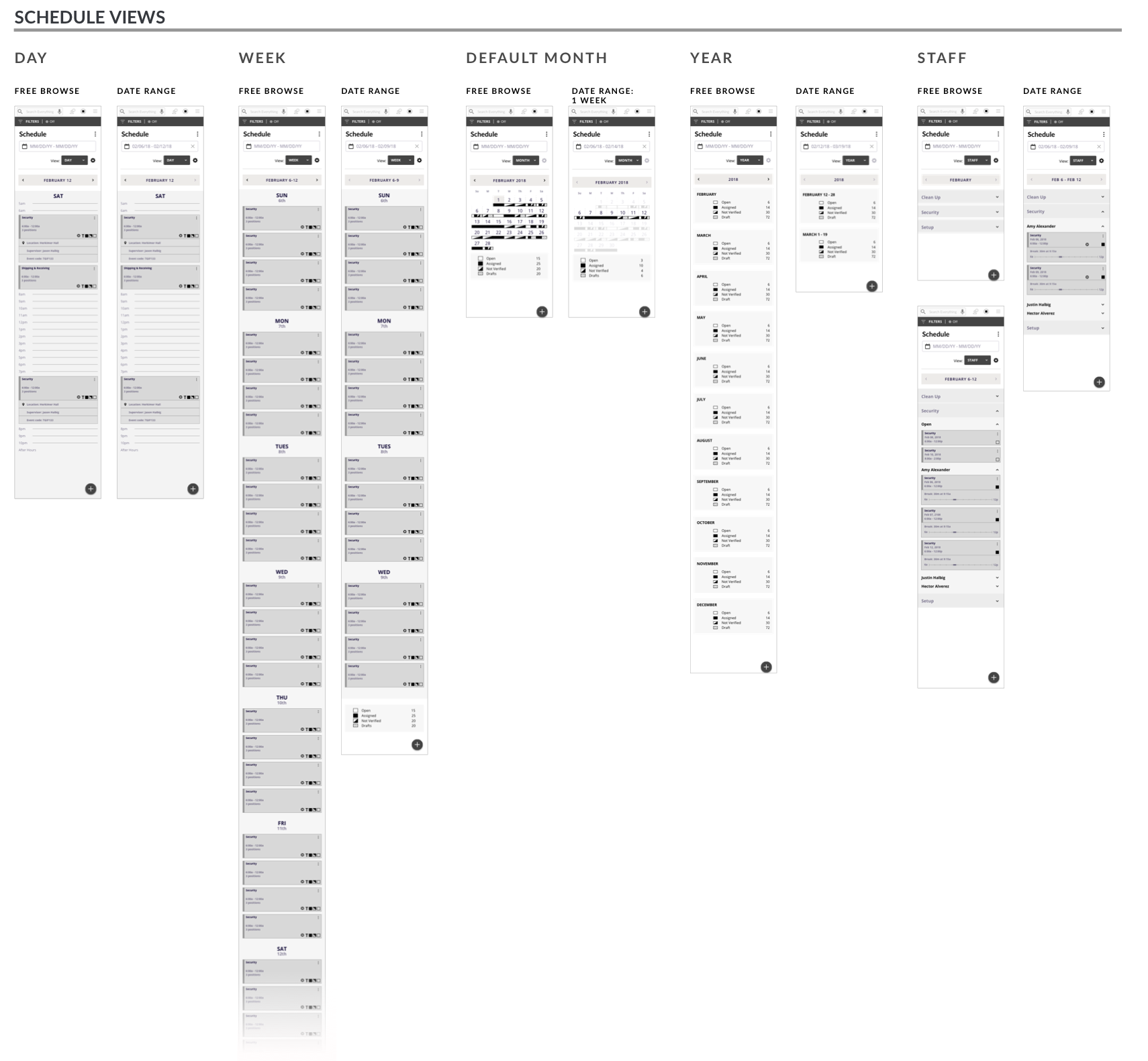
Cluttered calendar month and week views. These were not responsive.
The Opportunity
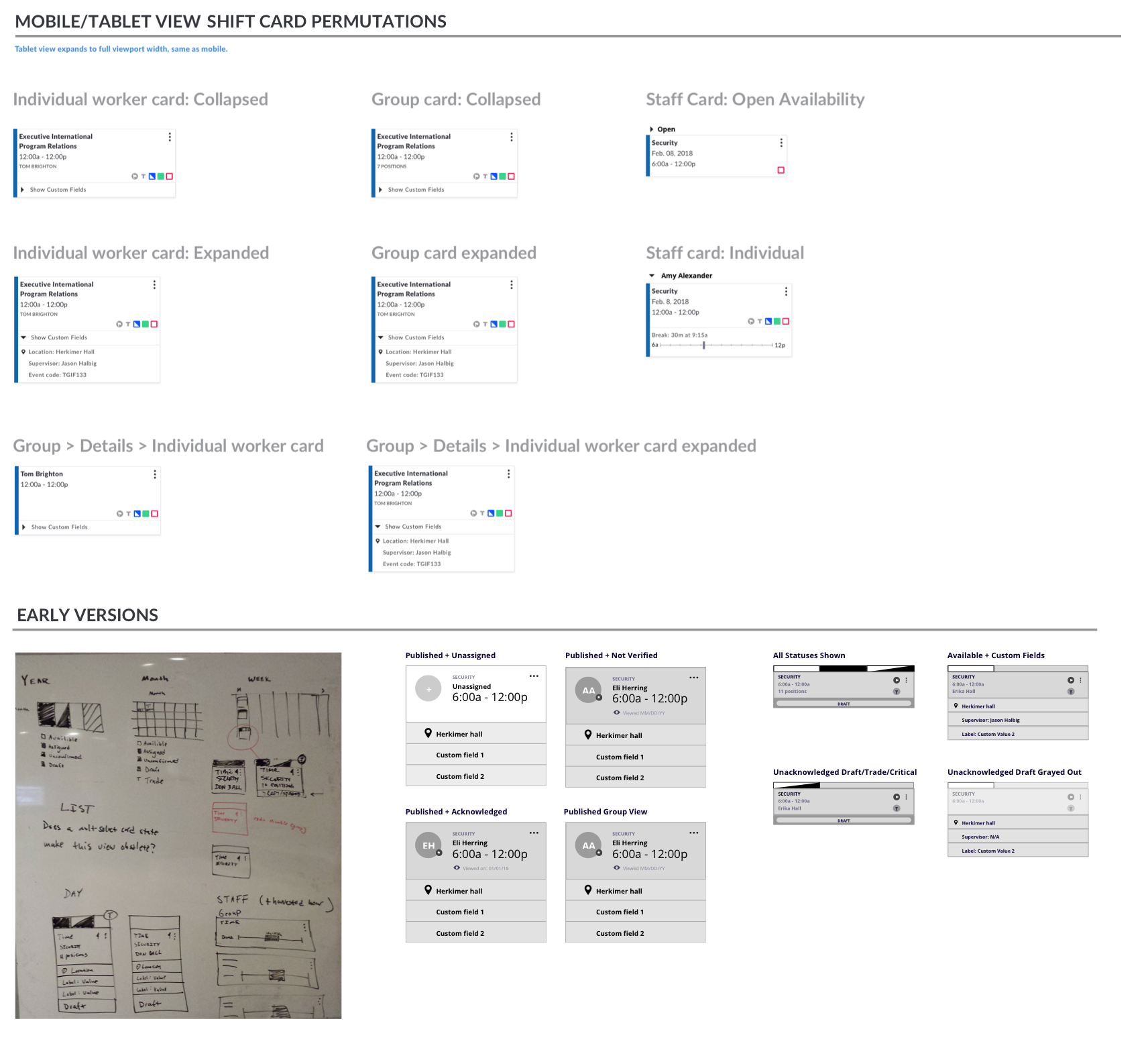
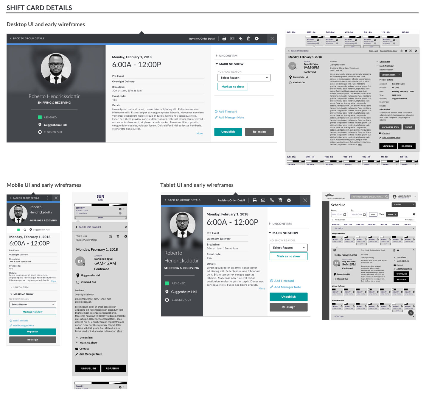
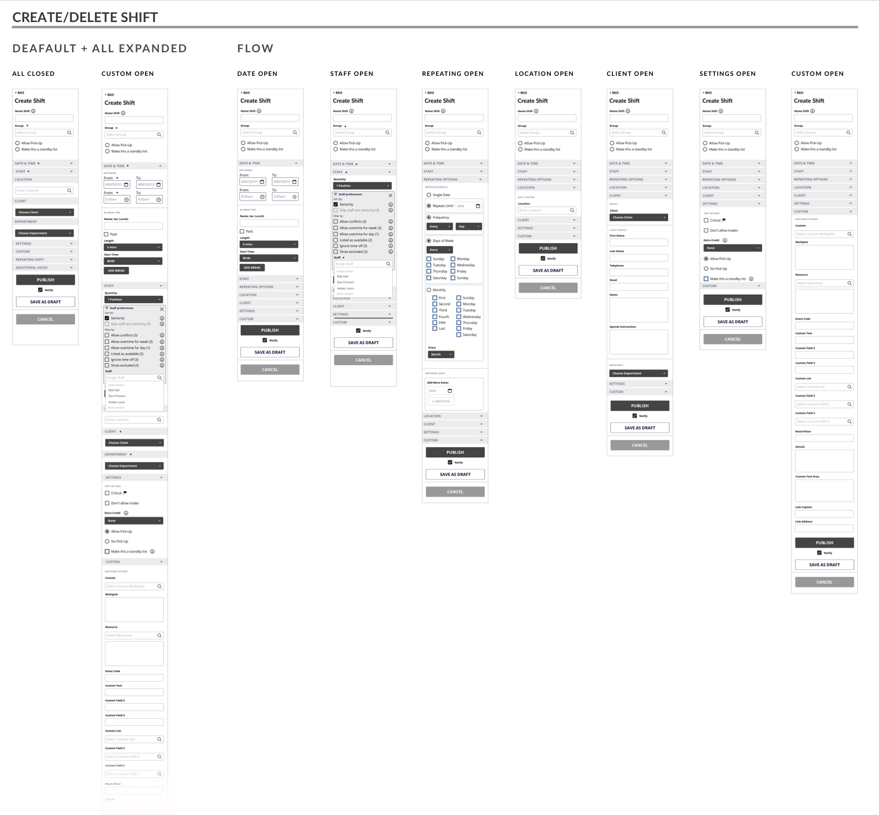
One of the most pressing issues concerned how to display individual and group shift information in the scheduling flow. Each module needed to have primary and secondary data, a way to drill down into details, and the ability to take or create actions pertaining to both the shift and the worker. These modules also had to work responsively in day, week, month and shift views. Alongside the Mentor team, I worked on scalable modules that were scannable, surfaced required information while allowing for customizable secondary fields, displayed the various shift states and were responsive. These became the building blocks for the entire scheduling flow.
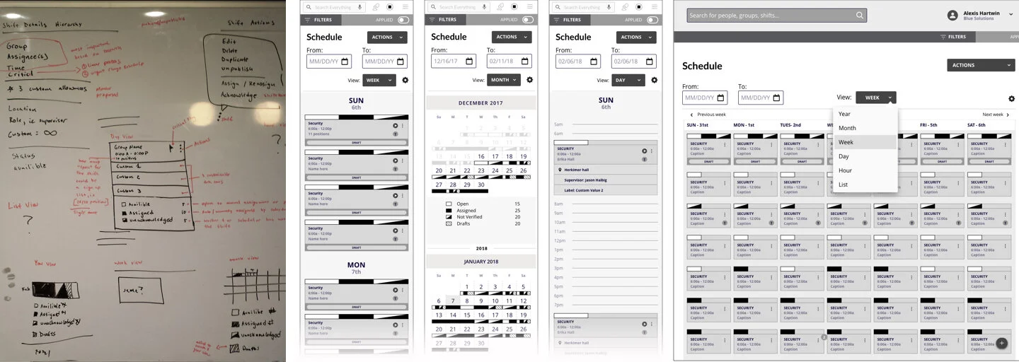
Early concepts and wireframes for the shift cards and schedule views.
Sketches + Wireframes
Taking the existing examples from the Shiftboard demo site, I then sketched out the user flow for multiple scenarios. From the flows I created wireframes, which were added to the prototype in InVision. There would typically be a few rounds of revisions, ensuring the design was consistent with the current testing sprint. Often in the process of designing a flow and/or wires, I’d uncover issues with the IA and UI, which we then had to address. Sometimes this could be as simple as figuring out how to group and nest filter sets and relevant information. Other times we’d go back to the client and recommend combining or eliminating navigation elements in order to simplify and clarify a user scenario.

Demo site example, user flow, sketches, wireframe versions.
Testing, Revising
After a round of user testing, I would make the recommended changes to the wires and/or design new solutions that solved a user problem. These wires would either go back into the next user testing cycle, or straight into UI design once the client had signed off.

Scenario for a mobile testing flow.
High Fidelity UI
In many cases, I’d convert the prototype wireframes into the final UI files which were then handed off to the development team. In the process of creating multiple permutations of the shift card UI I discovered a rather large problem; that the proposed maximum width of the module in the calendar view was actually the minimum width. Anything smaller turned into a jumbled mess, and was unreadable. This meant that we had to change the interaction for the navigation and filter bars on desktop, and abandon the portrait tablet calendar view altogether. Since the new site would be responsive, I proposed the portrait view mirror the mobile experience. It wasn’t completely ideal, but the alternative was a non-starter, and the user could simply rotate the tablet to get a more usable experience.
Handoff
I designed multiple mobile-first user flows, including responsive wireframes and UI. As of this writing the project is still ongoing.