Overview
The University of Washington Bothell was looking to redesign its dated and unresponsive site. The first stage of that plan was overhauling their global navigation and their Admissions landing page to make it easier for students to apply online.
Role: Research, IA, UX, Prototyping, User testing
Senior UX Designer: Gabi Meneguelli
Student worker: Julia Owens
Tools: Optimal workshop, Axure, Zoom, Google analytics


1
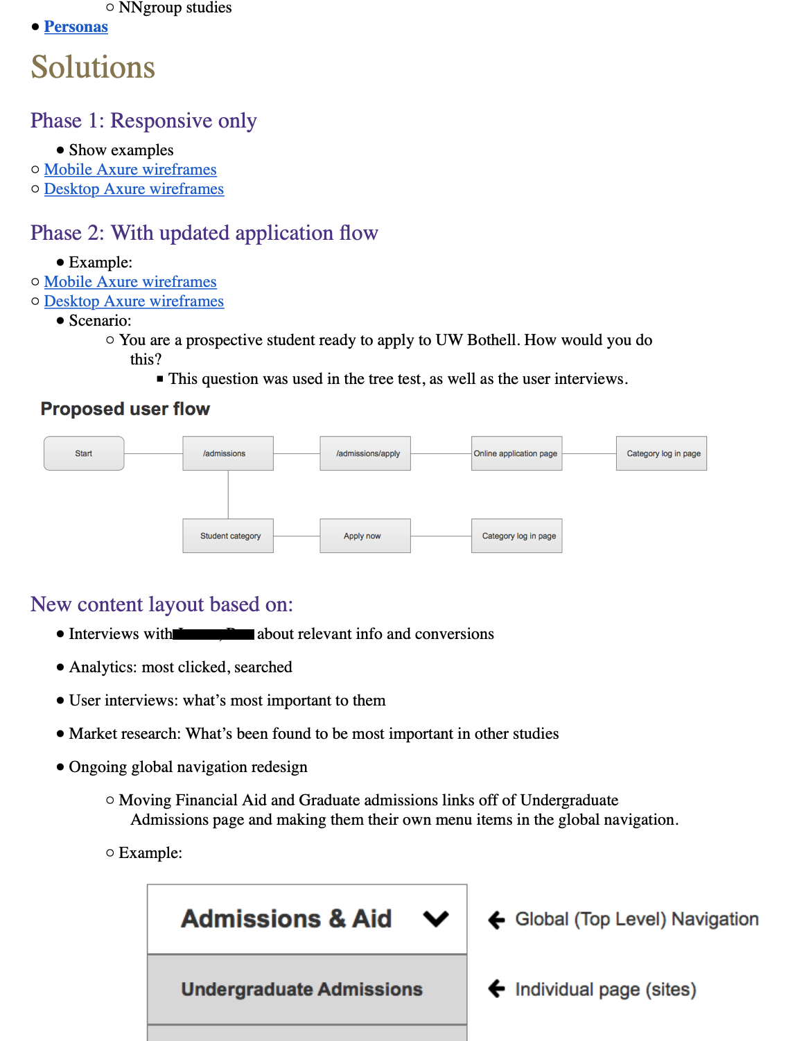
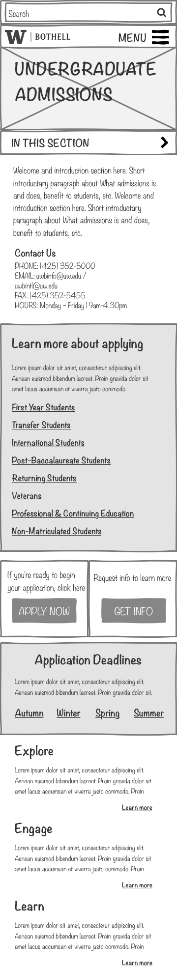
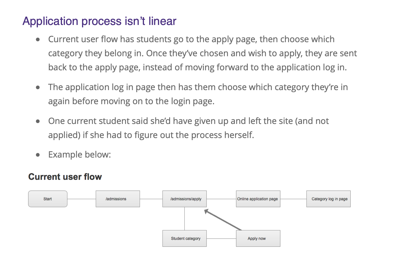
The global navigation was a convoluted mess. Students couldn’t or wouldn’t use it, preferring to use Google to find what they needed. The site was oriented by audience categories, which was unintuitive to users. The Admissions page served as an entrance point to the University and the application “sales funnel.” It was also confusing, buried relevant information, and lacked any kind of content strategy. The application flow was likewise frustrating, taking students in circles rather than moving them through a linear and straightforward process.

2
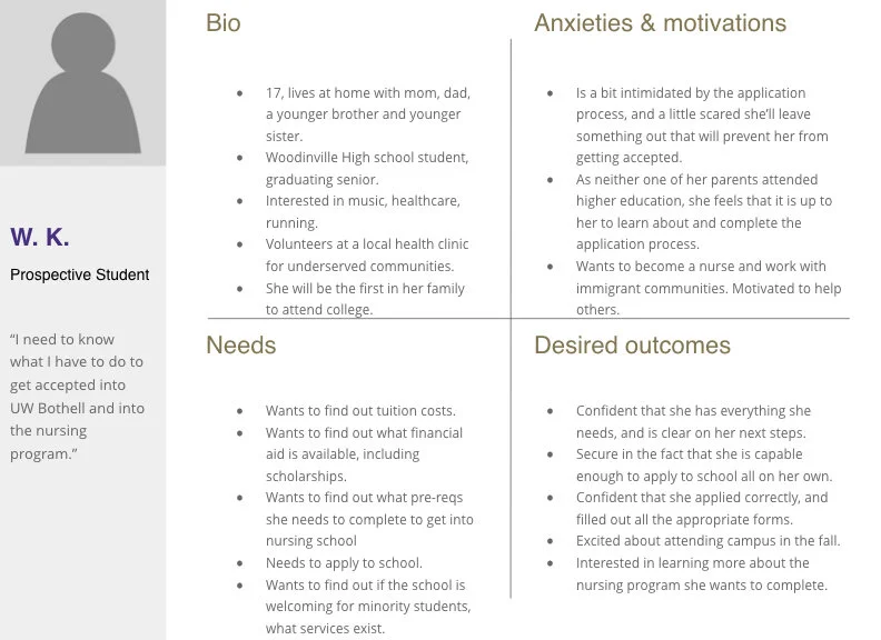
I began with market research and comparison analysis, reviewing case studies and other university sites. At the same time, I held stakeholder interviews, uncovering their problems, priorities, and KPIs. In the kickoff meeting, I persuaded the stakeholders to re-asses their assumptions for project outcomes, and come up with a solid direction and deliverables. They determined who the other stakeholders were, who were the final decision makers, those who should be kept in the loop, who the users were, and potential roadblocks. I reviewed previous quantitative research, conducted competitive audits, and created a sprint timeline. With a plan in place, I began gathering users for interviews and testing.


3
One of the biggest issues we ran into was timing. It was the end of the school year and students were in finals mode. Faculty were just as busy. Recruiting enough users to get relevant data was a challenge. We turned to the Admissions department to recruit prospective students, and I crafted recruitment emails for them to send out. To get current students, we talked to staff at the International Student Center and the IT department, as well as student workers in the Advancement office who ran student activity clubs.
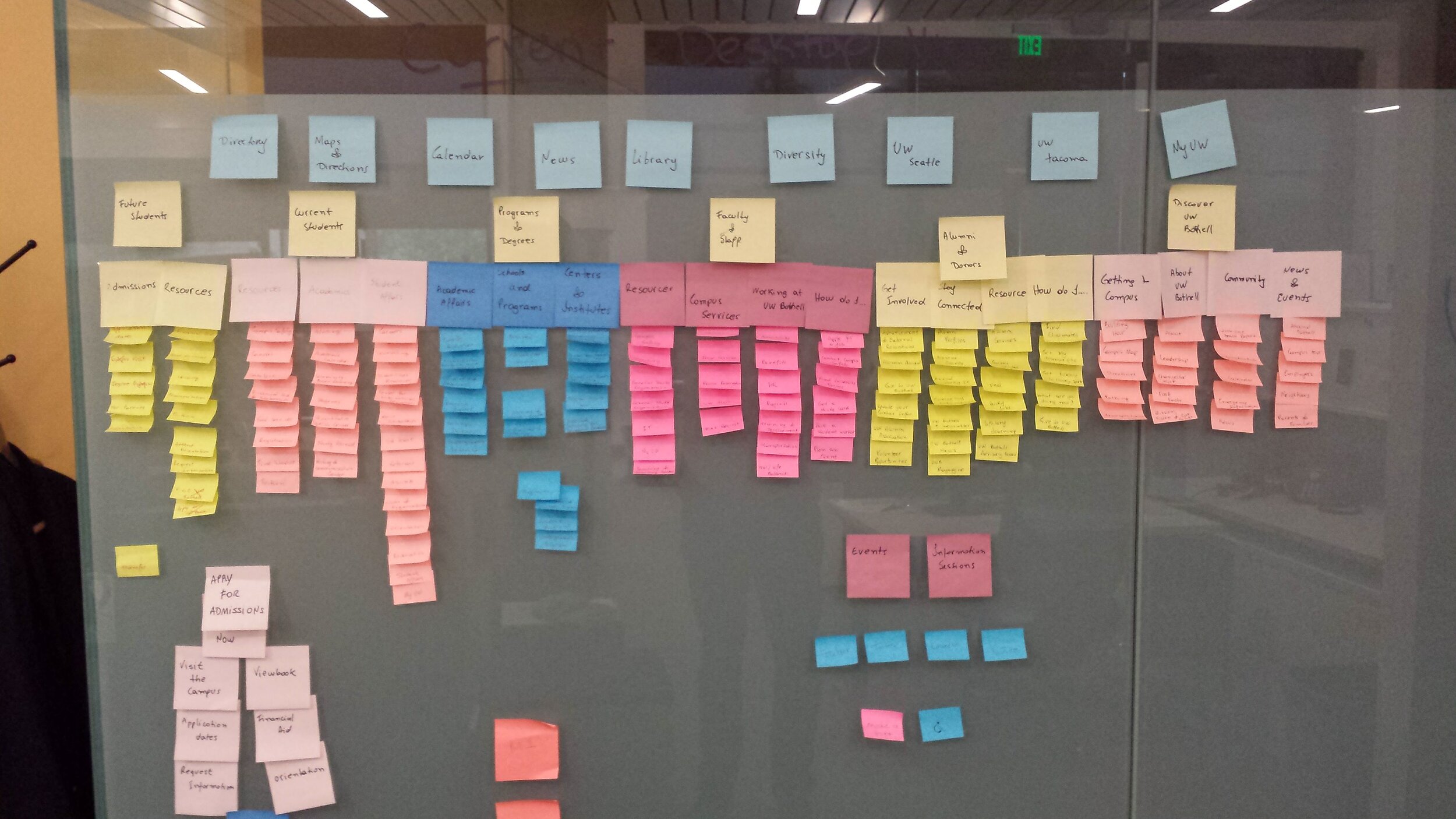
This diverse student population produced a treasure trove of useful data. The interviews were instrumental in developing a taxonomy, creating user personas and journeys, and information architecture for the site.

4
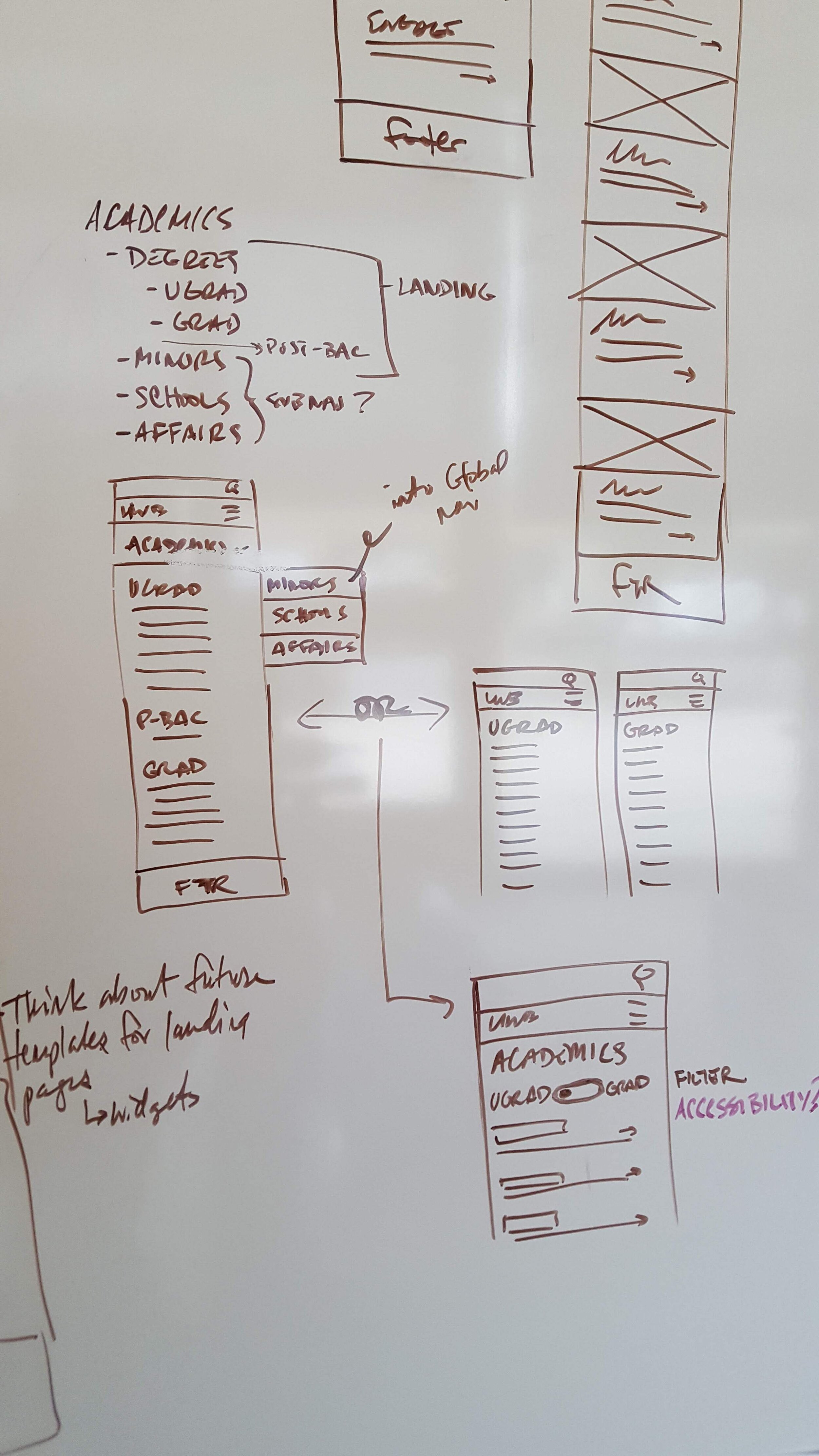
Taking these themes, and armed with market research and quantitative data, I started with paper prototypes. The initial concepts explored the global navigation, and included content strategy for the admissions page. After reviewing with stakeholders, I designed desktop versions, translating those into interactive prototypes using Axure.
The new design restructured the current information by encouraging prospective students to enter the admissions funnel. It also surfaced the information they were most interested in, instead of burying it.
The prototype sold the concept the best, allowing stakeholders to visualize how a user would move through the a site that accurately conformed to their mental model of how a university site should be structured.


Outcome
Universities aren’t typically known for moving quickly. There are usually a few decision makers, and multiple layers of bureaucracy to navigate. That being said, I was able to show what a clear and concise site architecture would look like, and recommend an admissions customer journey backed by solid user data. I delivered artifacts including market analysis, site audits, personas, journeys, and numerous research documents. I left the team with a clear path forward, and a few months later received word they had finalized the architecture using my recommendations.

The proposed top-level information architecture.